TL;DR: When SwiftUI’s Text displays an ellipsis (truncation), it usually means the parent view isn’t offering enough space. To force expansion, use .fixedSize(horizontal: false, vertical: true); to shrink the font on a single line, use .minimumScaleFactor; for dynamic layout switching based on available space, iOS 16’s ViewThatFits is the best choice.
The Problem
In SwiftUI, the Text component defaults to “adaptive” behavior. When the space offered by the parent view (the Proposed Size) is smaller than the actual size required to render the text, Text prioritizes truncating the content (showing ...) rather than automatically pushing the layout bounds or shrinking the font size.
Solutions
Here are 4 standard solutions tailored to different business scenarios:
1. Forcing Expansion: fixedSize
The fixedSize modifier tells SwiftUI: “Ignore the parent view’s proposed size and give me enough space to display the full content.”
- Use Case: Multiline text inside a
ListorVStackthat is getting cut off vertically.
// Case A: Ignore all constraints (May overflow screen boundaries)
Text("This is a very long text...")
    .fixedSize()

// Case B: Standard multiline text mode (Recommended)
// Width respects parent constraints; height expands to fit all text
Text("This is a long text that needs to wrap automatically...")
    .fixedSize(horizontal: false, vertical: true)
2. Automatic Scaling: minimumScaleFactor
This allows the text to automatically shrink its font size when space is limited, down to a specified minimum ratio.
- Use Case: Dashboard numbers, card subtitles, or headers where keeping the text on a single line is more important than a consistent font size.
Text("This is a very long text that might be truncated.")
    .lineLimit(1)            // Limit to a single line
    .minimumScaleFactor(0.5) // Allow shrinking down to 50% of original font size
    .frame(width: 200)
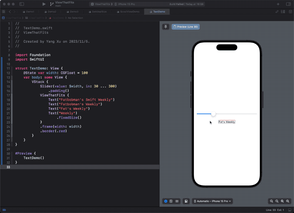
3. Adaptive Switching: ViewThatFits (iOS 16+)
ViewThatFits is a powerful tool in the modern SwiftUI layout system. It evaluates the provided child views in order and selects the first one that “fits fully within the available space.”
- Use Case: Showing full text when space permits, but switching to a shorter summary or an icon when space is tight.
struct AdaptiveTextDemo: View {
    var body: some View {
        ViewThatFits(in: .horizontal) {
            // 1. Try showing the full long text first
            Text("This is a very long text that might be truncated.")

            // 2. If that doesn't fit, try the shorter version
            Text("This is a long text.")

            // 3. Fallback for very tight spaces
            Text("Short.")
        }
        .frame(width: 200) // Simulating a width constraint
        .border(.red)
    }
}
4. Scrolling: ScrollView
When content length is uncontrollable and screen real estate is strictly limited, scrolling is the only viable option.
- Use Case: User agreements, long descriptions, or logs.
ScrollView {
    Text("This is a very long text...")
        .frame(maxWidth: .infinity, alignment: .leading)
}
Summary
| Strategy | Key Concept | Ideal Scenario |
|---|---|---|
| fixedSize | Force Wrap | Must display full content, vertical space is flexible. |
| minimumScaleFactor | Auto Shrink | Dashboard metrics, single-line headers; font size consistency is secondary. |
| ViewThatFits | Adaptive Layout | Responsive design; display different content content based on width. |
| ScrollView | Scrolling | Extremely long text content (e.g., articles). |