Updated Note, December 2025: While the core logic still holds, some APIs (such as
onChangeand Introspect) have changed. The content has been adjusted to fit the modern development environment.
This article discusses various experiences, tips, and caveats related to SwiftUI TextField, including events, focus switching, and keyboard configuration.
Events
onEditingChanged
When a TextField gains focus (enters the editable state), onEditingChanged calls the given method with the value true. When the TextField loses focus, it calls the method again with the value false.
struct OnEditingChangedDemo:View{
    @State var name = ""
    var body: some View{
        List{
            TextField("name:",text:$name,onEditingChanged: getFocus)
        }
    }

    func getFocus(focused:Bool) {
        print("get focus:\(focused ? "true" : "false")")
    }
}
The parameter name can be misleading — do not use onEditingChanged to determine whether the user has entered any content.
Note that the initializers using ParseableFormatStyle (such as TextField(value:format:)) usually do not provide this parameter. Therefore, for TextFields that use the new Formatter, you need to rely on FocusState or other mechanisms to determine whether they have gained or lost focus.
onCommit
onCommit is triggered when the user presses (or taps) the return key while typing (it cannot be programmatically triggered). If the user does not tap the return key (for example, if they directly switch to another TextField), onCommit will not be triggered. When onCommit is triggered, the TextField also loses focus.
struct OnCommitDemo:View{
    @State var name = ""
    var body: some View{
        List{
            TextField("name:",text: $name,onCommit: {print("commit")})
        }
    }
}
If you need to validate user input after they finish typing, it is best to combine onCommit with onEditingChanged. If you need to process user input in real time, please refer to SwiftUI TextField Advanced — Formatting and Validation (2025).
onCommit also works on SecureField.
In modern SwiftUI development, it is recommended to use the more powerful onSubmit instead of onCommit.
onSubmit
onSubmit is the preferred way to handle submit events in modern SwiftUI. While onCommit and onEditingChanged describe the state of each TextField individually, onSubmit allows you to manage and coordinate multiple TextFields in a view from a higher-level perspective.
// Definition of onSubmit
extension View {
    public func onSubmit(of triggers: SubmitTriggers = .text, _ action: @escaping (() -> Void)) -> some View
}
The following code behaves the same as the earlier onCommit example:
struct OnSubmitDemo:View{
    @State var name = ""
    var body: some View{
        List{
            TextField("name:",text: $name)
                .onSubmit {
                    print("commit")
                }
        }
    }
}
The triggering condition for onSubmit is the same as onCommit: the user must explicitly tap return.
onSubmit also applies to SecureField.
Scope and Nesting
Under the hood, onSubmit works by setting the environment value TriggerSubmitActio (not yet exposed to developers). As a result, onSubmit has a scope (it propagates up the view tree) and can be nested.
struct OnSubmitDemo: View {
    @State var text1 = ""
    @State var text2 = ""
    @State var text3 = ""
    var body: some View {
        Form {
            Group {
                TextField("text1", text: $text1)
                    .onSubmit { print("text1 commit") }
                TextField("text2", text: $text2)
                    .onSubmit { print("text2 commit") }
            }
            .onSubmit { print("textfield in group commit") }
            TextField("text3", text: $text3)
                .onSubmit { print("text3 commit") }
        }
        .onSubmit { print("textfield in form commit1") }
        .onSubmit { print("textfield in form commit2") }
    }
}
When the TextField (text1) commits, the console output is:
textfield in form commit2
textfield in form commit1
textfield in group commit
text1 commit
Note that the call order goes from outer to inner.
Limiting the Scope
You can use submitScope to block the propagation of the submit scope (prevent it from being passed further up the view tree). For example, in the code above, add submitScope after the Group:
Group {
    TextField("text1", text: $text1)
       .onSubmit { print("text1 commit") }
    TextField("text2", text: $text2)
        .onSubmit { print("text2 commit") }
    }
    .submitScope()  // Block scope propagation
    .onSubmit { print("textfield in group commit") }
When TextField1 commits, the console output is:
text1 commitAt this point, the scope of onSubmit is limited to within the Group.
When a view contains multiple TextFields, combining onSubmit with FocusState (introduced later) can provide a great user experience.
Support for searchable
For the search bar introduced in iOS 15, tapping return will also trigger onSubmit, but you need to set the triggers to .search:
struct OnSubmitForSearchableDemo:View{
    @State var name = ""
    @State var searchText = ""
    var body: some View{
        NavigationView{
            Form{
                TextField("name:",text:$name)
                    .onSubmit {print("textField commit")}
            }
            .searchable(text: $searchText)
            .onSubmit(of: .search) { //
                print("searchField commit")
            }
        }
    }
}
Note that SubmitTriggers is an OptionSet. The SubmitTriggers values set by onSubmit propagate through the view tree via the environment. When the SubmitTriggers received does not contain the values specified by onSubmit, propagation stops. In simple terms, onSubmit(of: .search) will block commit states originating from a TextField. The reverse is also true.
For example, in the code above, if we add another onSubmit(of: .text) after searchable, it will not respond to the TextField’s commit event:
.searchable(text: $searchText)
.onSubmit(of: .search) {
    print("searchField commit1")
}
.onSubmit {print("textField commit")} // Cannot be triggered, blocked by .search
Therefore, when handling both a TextField and a search field at the same time, pay close attention to the order in which they are declared.
You can support both TextField and search field in a single onSubmit like this:
.onSubmit(of: [.text, .search]) {
  print("Something has been submitted")
}
In the following code, because onSubmit(of: .search) is placed before searchable, it similarly will not be triggered:
NavigationStack{
    Form{
        TextField("name:",text:$name)
            .onSubmit {print("textField commit")}
    }
    .onSubmit(of: .search) { // Will not be triggered
        print("searchField commit1")
    }
    .searchable(text: $searchText)
}
Focus
Prior to iOS 15 / macOS Monterey, SwiftUI did not provide a way for TextField to gain focus (such as becomeFirstResponder). For a long time, developers had to rely on non-SwiftUI methods to achieve similar functionality.
In modern SwiftUI, Apple provides a solution that works far better than expected. Similar to onSubmit, it lets you manage and test the focus state of TextFields from a higher level in the view hierarchy.
Basic Usage
SwiftUI provides a new property wrapper FocusState to help us determine whether a TextField in a view has focus. You associate a FocusState with a specific TextField using focused.
struct OnFocusDemo:View{
    @FocusState var isNameFocused:Bool
    @State var name = ""
    var body: some View{
        List{
            TextField("name:",text:$name)
                .focused($isNameFocused)
        }
        .onChange(of: isNameFocused) { _, value in
            print(value)
        }
    }
}
The above code sets isNameFocused to true when the TextField gains focus, and to false when it loses focus.
For multiple TextFields within the same view, you can create several FocusStates to associate with each one:
struct OnFocusDemo: View {
    @FocusState var isNameFocused: Bool
    @FocusState var isPasswordFocused: Bool
    @State var name = ""
    @State var password = ""
    var body: some View {
        List {
            TextField("name:", text: $name)
                .focused($isNameFocused)
            SecureField("password:", text: $password)
                .focused($isPasswordFocused)
        }
        .onChange(of: isNameFocused) { _, value in
            print(value)
        }
        .onChange(of: isPasswordFocused) { _, value in
            print(value)
        }
    }
}
However, this approach becomes cumbersome when the view contains more TextFields and does not scale well for unified management. Fortunately, FocusState supports not only Boolean values but any hashable type. We can use a Hashable enum to centrally manage multiple TextField focus states in the view. The following code achieves the same behavior as the above example:
struct OnFocusDemo: View {
    @FocusState var focus: FocusedField?
    @State var name = ""
    @State var password = ""
    var body: some View {
        List {
            TextField("name:", text: $name)
                .focused($focus, equals: .name)
            SecureField("password:", text: $password)
                .focused($focus, equals: .password)
        }
        .onChange(of: focus) { _, value in
             print(value ?? "nil")
        }
    }

    enum FocusedField: Hashable {
        case name, password
    }
}
Automatically Focusing a TextField When the View Appears
With FocusState, it is easy to automatically focus a specific TextField and bring up the keyboard when the view appears:
struct OnFocusDemo: View {
    @FocusState var focus: FocusedField?
    @State var name = ""
    @State var password = ""
    var body: some View {
        List {
            TextField("name:", text: $name)
                .focused($focus, equals: .name)
            SecureField("password:", text: $password)
                .focused($focus, equals: .password)
        }
        .onAppear {
            DispatchQueue.main.asyncAfter(deadline: .now() + 0.5) { // Delay needed only on older versions
                focus = .name
            }
        }
    }

    enum FocusedField: Hashable {
        case name, password
    }
}
In earlier SwiftUI versions, onAppear needs a small delay for a TextField to successfully gain focus.
Switching Focus Between Multiple TextField Instances
By combining focused and onSubmit, we can move focus to the next TextField automatically when the user finishes typing in the current one (taps return):
struct OnFocusDemo: View {
    @FocusState var focus: FocusedField?
    @State var name = ""
    @State var email = ""
    @State var phoneNumber = ""
    var body: some View {
        List {
            TextField("Name:", text: $name)
                .focused($focus, equals: .name)
                .onSubmit {
                    focus = .email
                }
            TextField("Email:", text: $email)
                .focused($focus, equals: .email)
                .onSubmit {
                    focus = .phone
                }
            TextField("PhoneNumber:", text: $phoneNumber)
                .focused($focus, equals: .phone)
                .onSubmit {
                    if !name.isEmpty && !email.isEmpty && !phoneNumber.isEmpty {
                        submit()
                    }
                }
        }
    }

    private func submit() {
        // submit all infos
        print("submit")
    }

    enum FocusedField: Hashable {
        case name, email, phone
    }
}
The same behavior can be rewritten using the propagation behavior of onSubmit:
List {
    TextField("Name:", text: $name)
        .focused($focus, equals: .name)
    TextField("Email:", text: $email)
        .focused($focus, equals: .email)
    TextField("PhoneNumber:", text: $phoneNumber)
        .focused($focus, equals: .phone)
}
.onSubmit {
    switch focus {
        case .name:
            focus = .email
        case .email:
            focus = .phone
        case .phone:
            if !name.isEmpty, !email.isEmpty, !phoneNumber.isEmpty {
                submit()
            }
        default:
            break
    }
}
Combined with custom buttons (e.g., in an accessory keyboard view) or keyboard shortcuts, we can also move the focus backward or jump directly to a specific TextField.
Focusing with Keyboard Shortcuts
When a view has multiple TextField (including SecureField) instances, we can naturally use the Tab key to move focus through the fields in order. However, SwiftUI does not directly support focusing an arbitrary TextField using a keyboard shortcut. By combining FocusState with keyboardShortcut, we can achieve this behavior on iPadOS and macOS.
Create focused helpers that support shortcut binding:
public extension View {
    func focused(_ condition: FocusState<Bool>.Binding, key: KeyEquivalent, modifiers: EventModifiers = .command) -> some View {
        focused(condition)
            .background(Button("") {
                condition.wrappedValue = true
            }
            .keyboardShortcut(key, modifiers: modifiers)
            .hidden()
            )
    }

    func focused<Value>(_ binding: FocusState<Value>.Binding, equals value: Value, key: KeyEquivalent, modifiers: EventModifiers = .command) -> some View where Value: Hashable {
        focused(binding, equals: value)
            .background(Button("") {
                binding.wrappedValue = value
            }
            .keyboardShortcut(key, modifiers: modifiers)
            .hidden()
            )
    }
}
Usage:
struct ShortcutFocusDemo: View {
    @FocusState var focus: FouceField?
    @State private var email = ""
    @State private var address = ""
    var body: some View {
        Form {
            TextField("email", text: $email)
                .focused($focus, equals: .email, key: "t")
            TextField("address", text: $address)
                .focused($focus, equals: .address, key: "a", modifiers: [.command, .shift, .option])
        }
    }

    enum FouceField: Hashable {
        case email
        case address
    }
}
When the user presses ⌘ + T, the TextField for email gains focus. When the user presses ⌘ + ⌥ + ⇧ + A, the TextField for address gains focus.
The above code behaves poorly in the iPad simulator (sometimes it fails to activate). Please test on a real device.
Creating Your Own onEditingChanged
For determining the focus state of a single TextField, the best choice remains onEditingChanged. However, for scenarios where onEditingChanged is not available (e.g., with the new Formatter), we can emulate similar behavior via FocusState.
- For a single
TextField:
public extension View {
    func focused(_ condition: FocusState<Bool>.Binding, onFocus: @escaping (Bool) -> Void) -> some View {
        focused(condition)
            .onChange(of: condition.wrappedValue) { _, value in
                onFocus(value == true)
            }
    }
}
Usage:
struct onEditingChangedFocusVersion: View {
    @FocusState var focus: Bool
    @State var price = 0
    var body: some View {
        Form {
            TextField("Price:", value: $price, format: .number)
                .focused($focus) { focused in
                    print(focused)
                }
        }
    }
}- For multiple
TextFields:
To avoid multiple calls after a TextField loses focus, we need to store the last focused FocusState value at the view level.
public extension View {
    func storeLastFocus<Value: Hashable>(current: FocusState<Value?>.Binding, last: Binding<Value?>) -> some View {
        onChange(of: current.wrappedValue) { _, newValue in
            if newValue != last.wrappedValue {
                last.wrappedValue = newValue
            }
        }
    }

    func focused<Value>(_ binding: FocusState<Value>.Binding, equals value: Value, last: Value?, onFocus: @escaping (Bool) -> Void) -> some View where Value: Hashable {
        return focused(binding, equals: value)
            .onChange(of: binding.wrappedValue) { _, focusValue in
                if focusValue == value {
                    onFocus(true)
                } else if last == value { // Trigger only once
                    onFocus(false)
                }
            }
    }
}
Usage:
struct OnFocusView: View {
    @FocusState private var focused: Focus?
    @State private var lastFocused: Focus?
    @State private var name = ""
    @State private var email = ""
    @State private var address = ""
    var body: some View {
        List {
            TextField("Name:", text: $name)
                .focused($focused, equals: .name, last: lastFocused) {
                    print("name:", $0)
                }
            TextField("Email:", text: $email)
                .focused($focused, equals: .email, last: lastFocused) {
                    print("email:", $0)
                }
            TextField("Address:", text: $address)
                .focused($focused, equals: .address, last: lastFocused) {
                    print("address:", $0)
                }
        }
        .storeLastFocus(current: $focused, last: $lastFocused) // Save the last focsed value
    }

    enum Focus {
        case name, email, address
    }
}
Keyboard
Using TextField inevitably means dealing with the software keyboard. This section introduces several examples related to the keyboard.
Keyboard Types
On iPhone, we can use keyboardType to configure the software keyboard to better assist user input or restrict the range of allowed characters.
For example:
struct KeyboardTypeDemo: View {
    @State var price: Double = 0
    var body: some View {
        Form {
            TextField("Price:", value: $price, format: .number.precision(.fractionLength(2)))
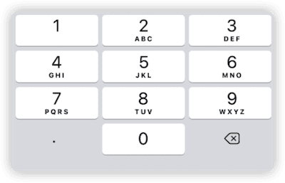
                .keyboardType(.decimalPad) // Numeric keyboard that supports decimal points
        }
    }
}
Currently there are 11 supported keyboard types:
-
asciiCapableASCII character keyboard -
numbersAndPunctuationNumbers and punctuation -
URLOptimized for entering URLs; includes characters plus.,/,.com -
numberPadRegion-specific numeric keypad (0–9, ۰–۹, ०–९, etc.). Suitable for positive integers or PINs. -
phonePadDigits plus symbols used in phone numbers, such as*#+ -
namePhonePadConvenient for entering both text and phone numbers. Character mode is similar toasciiCapable; numeric mode is similar tonumberPad. -
emailAddressAnasciiCapablekeyboard optimized for entering@and. -
decimalPadAnumberPadwith a decimal point, as shown above -
twitterAnasciiCapablekeyboard that includes@and# -
webSearchAnasciiCapablekeyboard with., where thereturnkey is labeledgo -
asciiCapableNumberPadAnasciiCapablekeyboard that includes digits
Although Apple provides many keyboard modes, they still may not cover all scenarios.
For example, numberPad and decimalPad do not include - or return. In modern SwiftUI, we can easily solve this problem by using the keyboard accessory view via toolbar (described later).
Getting Suggestions with TextContentType
In some iOS apps, when entering text you may see suggestions above the keyboard, such as phone numbers, emails, or verification codes. These are provided by textContentType.
By setting UITextContentType on a TextField, the system can infer what you might want to enter and show appropriate suggestions.
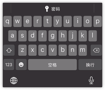
The following code enables the keychain when entering a password:
struct KeyboardTypeDemo: View {
    @State var password = ""
    var body: some View {
        Form {
            SecureField("", text: $password)
                .textContentType(.password)
        }
    }
}
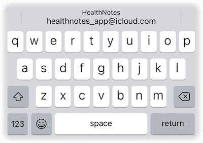
The following code suggests email addresses based on your contacts and mail history:
struct KeyboardTypeDemo: View {
    @State var email = ""
    var body: some View {
        Form {
            TextField("", text: $email)
                .textContentType(.emailAddress)
        }
    }
}
There are many UITextContentType options. Common ones include:
password- Name-related options, such as
name,givenName,middleName, etc. - Address-related options, such as
addressCity,fullStreetAddress,postalCode, etc. telephoneNumberemailAddressoneTimeCode(verification code)
It’s best to test
textContentTypeon a real device. The simulator does not support some items or may not have enough data to provide suggestions.
Dismissing the Keyboard
In some cases, we need to hide the software keyboard after the user finishes typing to free up more screen space.
Using scrollDismissesKeyboard (iOS 16+)
In modern iOS development, the best practice for dismissing the keyboard while scrolling a list is to use the scrollDismissesKeyboard modifier. Introduced in iOS 16, this API is fully native and requires no hacks.
ScrollView {
    TextField("Text", text: $text)
}
.scrollDismissesKeyboard(.immediately) // Dismiss keyboard immediately on scroll
Dismissing via FocusState
If a TextField has an associated FocusState, you can dismiss the keyboard by setting that focus value to false or nil:
struct HideKeyboardView: View {
    @State private var name = ""
    @FocusState private var nameIsFocused: Bool

    var body: some View {
        Form {
            TextField("Enter your name", text: $name)
                .focused($nameIsFocused)

            Button("dismiss Keyboard") {
                nameIsFocused = false
            }
        }
    }
}
Using UIKit APIs (Legacy Method)
More generally, you can dismiss the keyboard using a UIKit method:
UIApplication.shared.sendAction(#selector(UIResponder.resignFirstResponder), to: nil, from: nil, for: nil)For example, the following code dismisses the keyboard when the user drags within the view:
struct ResignKeyboardOnDragGesture: ViewModifier {
    var gesture = DragGesture().onChanged { _ in
        UIApplication.shared.sendAction(#selector(UIResponder.resignFirstResponder), to: nil, from: nil, for: nil)
    }

    func body(content: Content) -> some View {
        content.gesture(gesture)
    }
}

extension View {
    func dismissKeyboard() -> some View {
        return modifier(ResignKeyboardOnDragGesture())
    }
}

struct HideKeyboardView: View {
    @State private var name = ""
    var body: some View {
        Form {
            TextField("Enter your name", text: $name)
        }
        .dismissKeyboard()
    }
}
Keyboard Accessory Views
Creating with toolbar
In SwiftUI, we can create a keyboard accessory view (inputAccessoryView) via ToolbarItem(placement: .keyboard, content: View).
A keyboard accessory view can solve many previously difficult problems and provide additional interaction options.
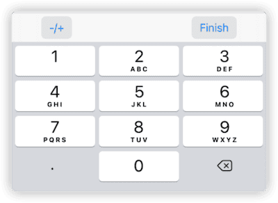
The following code adds a sign-toggle button and a confirm button when entering floating-point numbers:
struct ToolbarKeyboardDemo: View {
    @State var price = ""
    var body: some View {
        Form {
            TextField("Price:", text: $price)
                .keyboardType(.decimalPad)
                .toolbar {
                    ToolbarItem(placement: .keyboard) {
                        HStack {
                            Button("-/+") {
                                if price.hasPrefix("-") {
                                    price.removeFirst()
                                } else {
                                    price = "-" + price
                                }
                            }
                            .buttonStyle(.bordered)
                            Spacer()
                            Button("Finish") {
                                UIApplication.shared.sendAction(#selector(UIResponder.resignFirstResponder), to: nil, from: nil, for: nil)
                                // do something
                            }
                            .buttonStyle(.bordered)
                        }
                        .padding(.horizontal, 30)
                    }
                }
        }
    }
}
Unfortunately, using ToolbarItem for keyboard accessory views still has some limitations:
-
Limited display area
The height is fixed, and you cannot fully utilize the accessory view’s display area. As with other types of toolbars, SwiftUI intervenes in the layout of the content.
-
Cannot set different accessory views for multiple TextFields in the same view
You cannot easily use slightly more complex conditional logic in
ToolbarItem. If you configure multipleTextFields separately, SwiftUI merges all their accessory contents into a single view.
Currently, SwiftUI’s intervention and handling of toolbar content is somewhat excessive. The intention is good — to help developers organize buttons more easily and automatically optimize for different platforms. However, the restrictions imposed by the result builder of
toolbarandToolbarItemare too strong to allow for more complex logic. Integrating keyboard accessory views into the toolbar logic is also somewhat puzzling.
Creating with UIKit
At this stage, using UIKit to implement keyboard accessory views remains the best option under SwiftUI. This approach gives you full control over the view and allows you to assign different accessory views to multiple TextFields in the same view.
We’ll use the SwiftUI-Introspect library to achieve this.
// You need to import the SwiftUIIntrospect library
import SwiftUIIntrospect

extension UIView {
    func constrainEdges(to other: UIView) {
        translatesAutoresizingMaskIntoConstraints = false
        NSLayoutConstraint.activate([
            leadingAnchor.constraint(equalTo: other.leadingAnchor),
            trailingAnchor.constraint(equalTo: other.trailingAnchor),
            topAnchor.constraint(equalTo: other.topAnchor),
            bottomAnchor.constraint(equalTo: other.bottomAnchor),
        ])
    }
}

extension View {
    func inputAccessoryView<Content: View>(@ViewBuilder content: @escaping () -> Content) -> some View {
        introspect(.textField, on: .iOS(.v15, .v16, .v17, .v18, .v26)) { td in
            let viewController = UIHostingController(rootView: content())
            viewController.view.constrainEdges(to: viewController.view)
            td.inputAccessoryView = viewController.view
        }
    }

    func inputAccessoryView<Content: View>(content: Content) -> some View {
        introspect(.textField, on: .iOS(.v15, .v16, .v17, .v18, .v26)) { td in
            let viewController = UIHostingController(rootView: content)
            viewController.view.constrainEdges(to: viewController.view)
            td.inputAccessoryView = viewController.view
        }
    }
}
Usage:
struct OnFocusDemo: View {
    @FocusState var focus: FocusedField?
    @State var name = ""
    @State var email = ""
    @State var phoneNumber = ""
    var body: some View {
        Form {
            TextField("Name:", text: $name)
                .focused($focus, equals: .name)
                .inputAccessoryView(content: accessoryView(focus: .name))

            TextField("Email:", text: $email)
                .focused($focus, equals: .email)
                .inputAccessoryView(content: accessoryView(focus: .email))

            TextField("PhoneNumber:", text: $phoneNumber)
                .focused($focus, equals: .phone)
        }
        .onSubmit {
            switch focus {
            case .name:
                focus = .email
            case .email:
                focus = .phone
            case .phone:
                if !name.isEmpty, !email.isEmpty, !phoneNumber.isEmpty {}
            default:
                break
            }
        }
    }
}

struct accessoryView: View {
    let focus: FocusedField?
    var body: some View {
        switch focus {
        case .name:
            Button("name") {}.padding(.vertical, 10)
        case .email:
            Button("email") {}.padding(.vertical, 10)
        default:
            EmptyView()
        }
    }
}
Custom SubmitLabel
By default, the submit button on the keyboard for TextField (SecureField) is labeled return. With the submitLabel modifier, we can change return to text that better fits the context of the input.
TextField("Username", text: $username)
    .submitLabel(.next)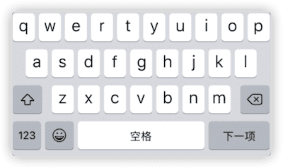
Currently supported styles include:
continuedonegojoinnextreturnroutesearchsend
For example, in the earlier code, we can set different submit labels for name, email, and phoneNumber:
TextField("Name:", text: $name)
    .focused($focus, equals: .name)
    .submitLabel(.next)

TextField("Email:", text: $email)
    .focused($focus, equals: .email)
    .submitLabel(.next)

TextField("PhoneNumber:", text: $phoneNumber)
    .focused($focus, equals: .phone)
    .submitLabel(.return)
Summary
Since SwiftUI 1.0, Apple has continuously improved the capabilities of TextField. In modern versions, SwiftUI not only provides more native modifiers, but also higher-level management mechanisms such as FocusState and onSubmit. The native functionality of SwiftUI’s key controls can now stand shoulder-to-shoulder with their UIKit counterparts.
I will cover more about customizing the appearance of TextField in a future article.