Recently, many of my friends have been saying that even though SwiftUI’s layout system has a low learning curve, they feel lost when facing more complex design requirements. Does SwiftUI really have the ability to create complex user interfaces? This article will demonstrate the power and flexibility of SwiftUI’s layout system by showing multiple ways to achieve the same layout, and help developers gain a better understanding of SwiftUI’s layout logic.
You can get the code for this article here.
Requirement
Not long ago, a netizen in the chat room proposed the following layout requirement:
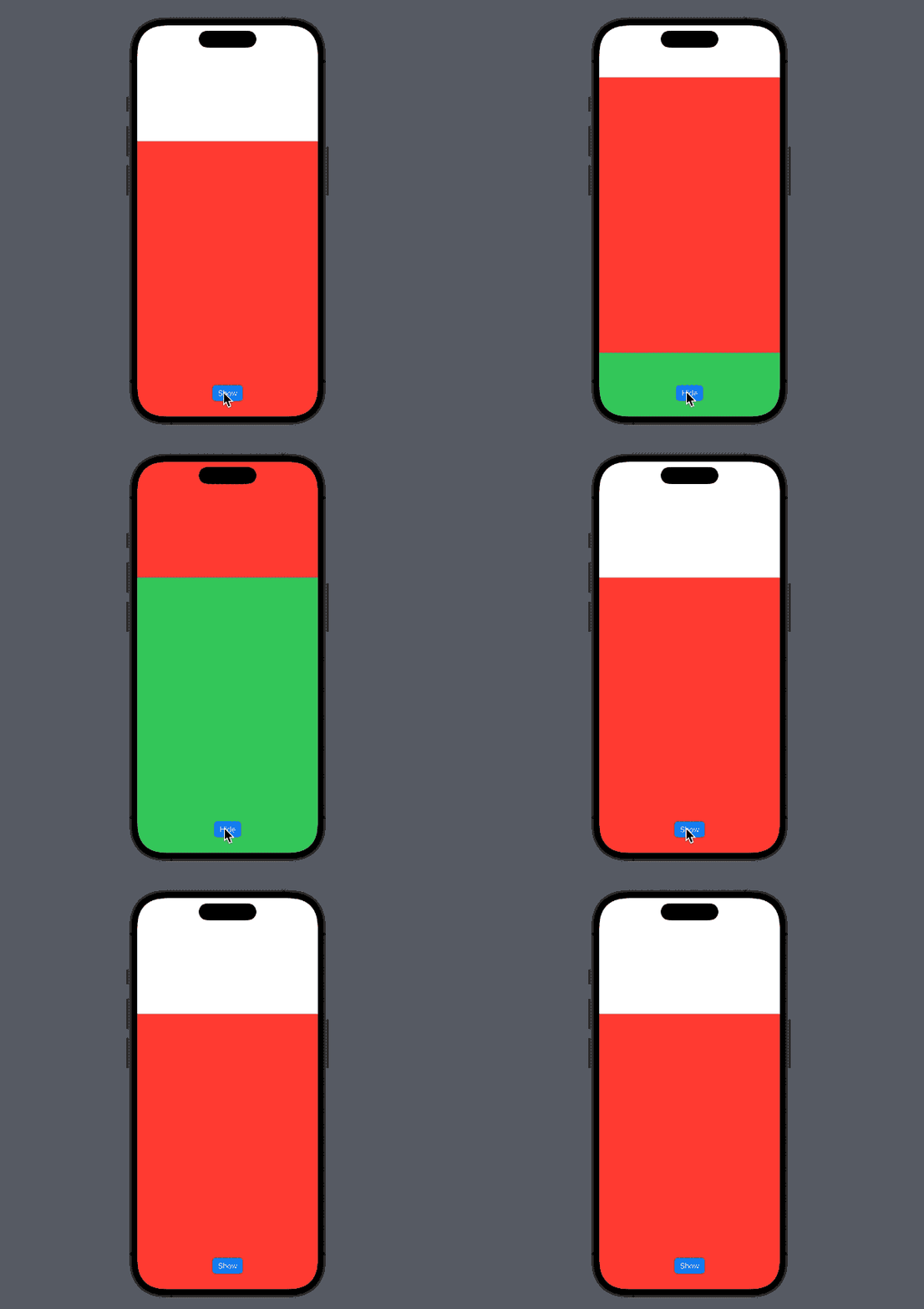
There are two vertically arranged views. In the initial state (show == false), the bottom of view 1 (red view) is aligned with the bottom of the screen. When show == true, the bottom of view 2 (green view) is aligned with the bottom of the screen.
The approximate effect is as follows:

Solution
For the above requirements, I believe many readers can come up with multiple solutions at the first time. In the following text, we will use various means provided by the SwiftUI layout system to achieve this requirement. Some of these solutions are very simple and direct, while others may be slightly cumbersome or circuitous. I will try to use different layout logics for each solution.
Preparation
First, we will extract some reusable code to simplify the subsequent work:
// View1
struct RedView: View {
    var body: some View {
        Rectangle()
            .fill(.red)
            .frame(height: 600)
    }
}

// View2
struct GreenView: View {
    var body: some View {
        Rectangle()
            .fill(.green)
            .frame(height: 600)
    }
}

// Switch Button
struct OverlayButton: View {
    @Binding var show: Bool
    var body: some View {
        Button(show ? "Hide" : "Show") {
            show.toggle()
        }
        .buttonStyle(.borderedProminent)
    }
}

extension View {
    func overlayButton(show: Binding<Bool>) -> some View {
        self
            .overlay(alignment: .bottom) {
                OverlayButton(show: show)
            }
    }
}

// get size of view
struct SizeInfoModifier: ViewModifier {
    @Binding var size: CGSize
    func body(content: Content) -> some View {
        content
            .background(
                GeometryReader { proxy in
                    Color.clear
                        .task(id: proxy.size) {
                            size = proxy.size
                        }
                }
            )
    }
}

extension View {
    func sizeInfo(_ size: Binding<CGSize>) -> some View {
        self
            .modifier(SizeInfoModifier(size: size))
    }
}
1. Offset
Using VStack + offset is a very intuitive approach.
struct OffsetDemo: View {
    @State var show = false
    @State var greenSize: CGSize = .zero
    var body: some View {
        Color.clear
            .overlay(alignment: .bottom) {
                VStack(spacing: 0) {
                    RedView()
                    GreenView()
                        .sizeInfo($greenSize)
                }
                .offset(y: show ? 0 : greenSize.height)
                .animation(.default, value: show)
            }
            .ignoresSafeArea()
            .overlayButton(show: $show)
    }
}
Code Tips:
Color.clear.ignoresSafeArea()will create a view that matches the screen size- Overlay can easily control the recommended size while enjoying convenient alignment settings
- Use
animation(.default, value: show)to associate animation with specific state changes
In the above code, considering that when show == true, the bottom of view 2 (green view) must be aligned with the bottom of the screen, therefore setting the alignment guide of the overlay to bottom can greatly simplify our initial layout declaration. Based on this layout, offset values were described for both states.
We can also use other modifiers (such as padding, position) to achieve the above requirements using this layout idea.
.offset(y: show ? 0 : greenSize.height)
.padding(.bottom, show ? 0 : -greenSize.height)
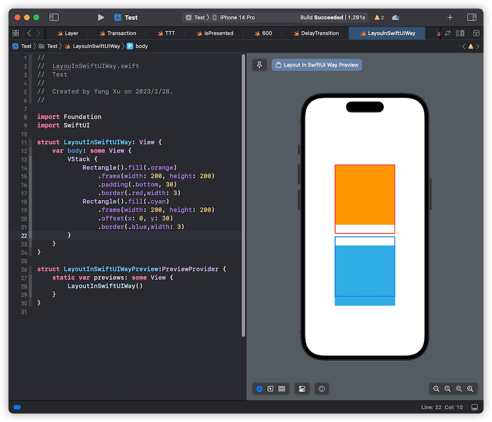
Although in this example, the visual presentation of offset and padding are consistent, there are still significant differences between the two when it comes to laying out with other views. Padding is an adjustment made at the layout level, and adding padding to a view will also affect the layout of other views. Offset, on the other hand, is a position adjustment made at the rendering level. Even if there is a change in position, other views will not consider its displacement when laying out. For more information on this, please refer to the “Surface and Content” section in the SwiftUI Layout - Size (Part 2) article.

2. AlignmentGuide
In SwiftUI, developers can use the alignmentGuide modifier to modify the value of a certain alignment guide of a view (by setting an explicit value). As Color.clear.overlay provides us with a relatively ideal layout environment, we can meet the requirements of this article by modifying the alignment guides of two views in different states.
struct AlignmentDemo: View {
    @State var show = false
    @State var greenSize: CGSize = .zero
    var body: some View {
        Color.clear
            .overlay(alignment: .bottom) {
                RedView()
                    .alignmentGuide(.bottom) {
                        show ? $0[.bottom] + greenSize.height : $0[.bottom]
                    }
            }
            .overlay(alignment: .bottom) {
                GreenView()
                    .sizeInfo($greenSize)
                    .alignmentGuide(.bottom) {
                        show ? $0[.bottom] : $0[.top]
                    }
            }
            .animation(.default, value: show)
            .ignoresSafeArea()
            .overlayButton(show: $show)
    }
}
In this solution, we place two views in two separate overlay layers. Although visually they still appear vertically arranged, they are actually not related to each other.
No matter how many overlay or background layers are added to the same view, their suggested size for the subviews remains the same (consistent with the original view size). In the above code, because both views use the same animation curve setting, there will be no separation during movement. However, if different animation curves are set for each view (e.g. one linear and one easeIn), the complete tightness between the views cannot be guaranteed during state transition.
For information on suggested size, required size, and other related content, please refer to the article “SwiftUI Layout: The Mystery of Size”.
3. NameSpace
Starting from version 3.0 (iOS 15), SwiftUI provides a new NameSpace and matchedGeometryEffect modifier, which allows developers to achieve complex requirements such as hero animation with minimal code.
Strictly speaking, NameSpace + matchedGeometryEffect is a unified encapsulation of a group of modifiers and codes. The geometric information (position, size) of specific views is saved through a namespace and ID, and automatically set to other views with requirements.
struct NameSpaceDemo: View {
    @State var show = false
    @Namespace var placeHolder
    @State var greenSize: CGSize = .zero
    @State var redSize: CGSize = .zero
    var body: some View {
        Color.clear
            // green placeholder
            .overlay(alignment: .bottom) {
                Color.clear // GreenView().opacity(0.01)
                    .frame(height: greenSize.height)
                    .matchedGeometryEffect(id: "bottom", in: placeHolder, anchor: .bottom, isSource: true)
                    .matchedGeometryEffect(id: "top", in: placeHolder, anchor: .top, isSource: true)
            }
            .overlay(
                GreenView()
                    .sizeInfo($greenSize)
                    .matchedGeometryEffect(id: "bottom", in: placeHolder, anchor: show ? .bottom : .top, isSource: false)
            )
            .overlay(
                RedView()
                    .matchedGeometryEffect(id: "top", in: placeHolder, anchor: show ? .bottom : .top, isSource: false)
            )
            .animation(.default, value: show)
            .ignoresSafeArea()
            .overlayButton(show: $show)
    }
}
In the above code, we drew a view that has the same size as view two in the first overlay (not displayed), and aligned its bottom edge with the screen’s bottom edge. We set two identifiers for the top and bottom of the placeholder view using matchedGeometryEffect to save information.
By using the corresponding ID position for view one and view two in the two states, we can achieve the requirements in this article.
NameSpace + matchedGeometryEffect is a very powerful combination, especially good at dealing with scenarios where both position and size change simultaneously. However, it should be noted that NameSpace is only applicable to sharing data in the same view tree. If there are two trees involved, such as the situation mentioned in the article “A piece of ‘paranormal code’ caused by @State injection mechanism,” it is impossible to share geometric information.
4. ScrollView
Considering the animation form (vertical scrolling) required in this article, we can also meet the requirements by using the scrolling positioning function provided by ScrollViewReader.
struct ScrollViewDemo: View {
    @State var show = false
    @State var screenSize: CGSize = .zero
    @State var redViewSize: CGSize = .zero
    var body: some View {
        Color.clear
            .overlay(
                ScrollViewReader { proxy in
                    ScrollView {
                        VStack(spacing: 0) {
                            Color.clear
                                .frame(height: screenSize.height - redViewSize.height)
                            RedView()
                                .sizeInfo($redViewSize)
                                .id("red")
                            GreenView()
                                .id("green")
                        }
                    }
                    .scrollDisabled(true)
                    .onAppear {
                        proxy.scrollTo("red", anchor: .bottom)
                    }
                    .onChange(of: show) { _ in
                        withAnimation {
                            if show {
                                proxy.scrollTo("green", anchor: .bottom)
                            } else {
                                proxy.scrollTo("red", anchor: .bottom)
                            }
                        }
                    }
                }
            )
            .sizeInfo($screenSize)
            .ignoresSafeArea()
            .overlayButton(show: $show)
    }
}
Although both use vertical axis, there is still a significant difference in the logic of handling various sizes between ScrollView and VStack.
ScrollView will create a scrolling area based on the entire suggested size given by the parent view, but will only provide ideal size when asking for the required size of its subviews. This means that in ScrollView, it is best for the subviews to explicitly set the size (make a clear request for the required size). Therefore, in the code above, the height of the top blank placeholder view needs to be calculated by the difference between the screen height and the height of view one.
By setting the anchor of scrollTo, we can make the view stop at a specific position under reasonable requirements. scrollDisabled allows us to disable ScrollView’s scrolling gesture in iOS 16+.
5. LayoutPriority
In SwiftUI, setting view priority (using layoutPriority) is a useful but not frequently used feature. When SwiftUI is laying out views, if the suggested size given by the layout container cannot meet the required size of all subviews, it will prioritize the layout requirements of views with higher priorities based on the Priority of the subviews.
struct LayoutPriorityDemo: View {
    @State var show = false
    @State var screenSize: CGSize = .zero
    @State var redViewSize: CGSize = .zero
    var body: some View {
        Color.clear
            .overlay(alignment: show ? .bottom : .top) {
                VStack(spacing: 0) {
                    Spacer()
                        .frame(height: screenSize.height - redViewSize.height)
                        .layoutPriority(show ? 0 : 2)
                    RedView()
                        .sizeInfo($redViewSize)
                        .layoutPriority(show ? 1 : 2)
                    GreenView().layoutPriority(show ? 2 : 0)
                }
                .animation(.default, value: show)
            }
            .sizeInfo($screenSize)
            .ignoresSafeArea()
            .overlayButton(show: $show)
    }
}
In the above code, we use overlay to adopt different layout guide strategies in two different states, and give the views different priority statuses during state transitions in order to achieve the desired layout results.
Although Spacer has a specific size, in state two, it does not participate in the layout due to the constrained suggested size. The same applies to view two.
6. AlignmentGuide Revisited
In the example using AlignmentGuide above, we obtained the height information of view two through GeometryReader and completed the movement by setting explicit alignment guides. In a sense, this approach is similar to offset, as it requires obtaining a specific displacement value to meet the needs.
In this example, although AlignmentGuide is still used, the specific size value does not need to be obtained to achieve the goal.
struct AlignmentWithoutGeometryReader: View {
    @State var show = false
    var body: some View {
        Color.clear
            .overlay(alignment: .bottom) {
                GreenView()
                    .alignmentGuide(.bottom) {
                        show ? $0[.bottom] : 0
                    }
                    .overlay(alignment: .top) {
                        RedView()
                            .alignmentGuide(.top) { $0[.bottom] }
                    }
                    .animation(.default, value: show)
            }
            .ignoresSafeArea()
            .overlayButton(show: $show)
    }
}
In the above code, we use the overlay nested with alignmentGuide to achieve the alignment binding between the bottom of view 1 and the top of view 2. Therefore, only the alignment guide of view 2 needs to be adjusted when the state is switched (view 1 will automatically move with view 2).
This method is visually similar to the implementation through VStack, but the two have significant differences in demand size. The vertical demand size of VStack is the sum of the heights of view 1 and view 2, while through overlay nesting, the vertical demand size is only the height of view 2 (although visually view 1 is above and closely connected to view 2).
7. Transition
By setting the transition for the view, SwiftUI will generate corresponding animation effects when the view is inserted or removed from the view tree.
struct TransitionDemo:View {
    @State var show = false
    var body: some View {
        Color.clear
            .overlay(alignment:.bottom){
                VStack(spacing:0) {
                    RedView()
                    if show {
                        GreenView()
                            .transition(.move(edge: .bottom))
                    }
                }
                .animation(.default, value: show)
            }
            .ignoresSafeArea()
            .overlayButton(show: $show)
    }
}
Please note that transitions have high requirements for the position and method of animation settings. Careless mistakes can result in complete or partial failure of the transition. For example, in this case, adding withAnimation to explicitly set the animation in the Button (when switching show state) will cause the transition to fail.
Transitions are one of the powerful capabilities provided by SwiftUI, which greatly simplifies the difficulty of implementing animations. The view manager I wrote, SwiftUI Overlay Container, is built on the full application of transition functionality.
For more information on transition animations, see the article on the animation mechanism of SwiftUI.
8. Layout Protocol
In version 4.0, SwiftUI added the Layout protocol, which allows developers to create custom layout containers for specific scenarios. Although the current requirement only involves two views, we can still extract scenario characteristics: under the premise of vertical arrangement, specify alignment of the bottom of the view with the bottom of the container view in a specific state.
struct LayoutProtocolDemo: View {
    @State var show = false
    var body: some View {
        Color.clear
            .overlay(
                AlignmentBottomLayout {
                    RedView()
                        .alignmentActive(show ? false : true)
                    GreenView()
                        .alignmentActive(show ? true : false)
                }
                .animation(.default, value: show)
            )
            .ignoresSafeArea()
            .overlayButton(show: $show)
    }
}

struct ActiveKey: LayoutValueKey {
    static var defaultValue = false
}

extension View {
    func alignmentActive(_ isActive: Bool) -> some View {
        layoutValue(key: ActiveKey.self, value: isActive)
    }
}

struct AlignmentBottomLayout: Layout {
    func makeCache(subviews: Subviews) -> Catch {
        .init()
    }

    func sizeThatFits(proposal: ProposedViewSize, subviews: Subviews, cache: inout Catch) -> CGSize {
        guard !subviews.isEmpty else { return .zero }
        var height: CGFloat = .zero
        for i in subviews.indices {
            let subview = subviews[i]
            if subview[ActiveKey.self] == true {
                cache.activeIndex = i
            }
            let viewDimension = subview.dimensions(in: proposal)
            height += viewDimension.height
            cache.sizes.append(.init(width: viewDimension.width, height: viewDimension.height))
        }
        return .init(width: proposal.replacingUnspecifiedDimensions().width, height: proposal.replacingUnspecifiedDimensions().height)
    }

    func placeSubviews(in bounds: CGRect, proposal: ProposedViewSize, subviews: Subviews, cache: inout Catch) {
        guard !subviews.isEmpty else { return }
        var currentY: CGFloat = bounds.height - cache.alignmentHeight + bounds.minY
        for i in subviews.indices {
            let subview = subviews[i]
            subview.place(at: .init(x: bounds.minX, y: currentY), anchor: .topLeading, proposal: proposal)
            currentY += cache.sizes[i].height
        }
    }
}

struct Catch {
    var activeIndex = 0
    var sizes: [CGSize] = []

    var alignmentHeight: CGFloat {
        guard !sizes.isEmpty else { return .zero }
        return sizes[0...activeIndex].map { $0.height }.reduce(0,+)
    }
}
In the above code, we indicate the view that is currently aligned with the bottom of the container through alignmentActive (LayoutValueKey).
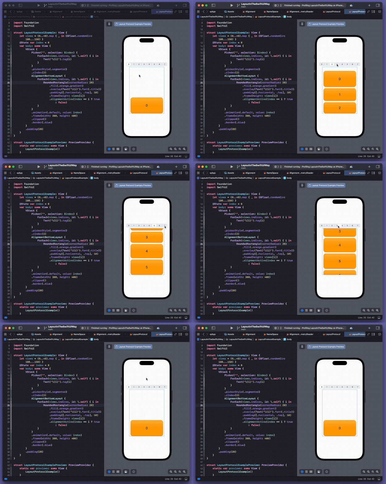
Undoubtedly, this is the most complex implementation among all the solutions. However, if we have a similar requirement, using this custom container will be very convenient.
struct LayoutProtocolExample: View {
    let views = (0..<8).map { _ in CGFloat.random(in: 100...150) }
    @State var index = 0
    var body: some View {
        VStack {
            Picker("", selection: $index) {
                ForEach(views.indices, id: \.self) { i in
                    Text("\(i)").tag(i)
                }
            }
            .pickerStyle(.segmented)
            .zIndex(2)
            AlignmentBottomLayout {
                ForEach(views.indices, id: \.self) { i in
                    RoundedRectangle(cornerRadius: 20)
                        .fill(.orange.gradient)
                        .overlay(Text("\(i)").font(.title))
                        .padding([.horizontal, .top], 10)
                        .frame(height: views[i])
                        .alignmentActive(index == i ? true : false)
                }
            }
            .animation(.default, value: index)
            .frame(width: 300, height: 400)
            .clipped()
            .border(.blue)
        }
        .padding(20)
    }
}
Summary
Like most layout frameworks, the upper limit of layout ability ultimately depends on the developer. SwiftUI provides us with many layout methods. Only by fully understanding and mastering them can we cope with complex layout requirements.